|
|

|
A Week of
RAINBOWS:
The Origin of Rainbows
Thank you for joining on
this Rainbow Color Journey! Each day you will have a new webpage
of color images and information, and a journal page to record
your experience for yourself. Color is individual, and this week
is about your exploration into which colors are the RIGHT ones
to employ in your life RIGHT NOW, and which ones you could
consider diminishing at this time.
There are no GOOD or BAD
colors... Each has their own beauty and power.
Before we begin our rainbow
color journey let's explore the origins of the rainbow.
Welcome Message from LuAnn

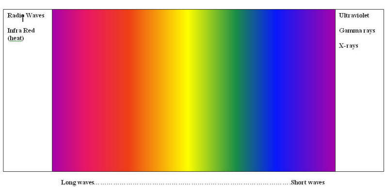
White light, or the color
we perceive as 'WHITE', contains every color in the rainbow. It
contains the energy of all possibilities, represents the concept
of YANG active energy, and it is from this white light that every
color originates.
Black is the absence of any
light wave. Objects that appear black are actually absorbing all
light waves. Black represents that energy of going within, is
protective and restful, quiet and contemplative.
White and Black are the
epitome of Yang and Yin, Heaven and Earth, Active and Passive.
Your Black and White
Image and Information to Contemplate
Journal Your Thoughts
|
Some INFORMATION about COLOR
Color is light wave energy
and is surrounding us and affecting us at all times.
In the dark of the night
there is much less light wave energy around us,
but its lack
also affects our body, mind and spirit.
|
Ceremony and
Superstition of Color Ceremonies/superstition have been associated with color
throughout centuries by all cultures:
o Black cats - considered omens of magic and mystery
o Black – Roman god of agriculture (Saturn) – midwinter festival
of Christmas
o Red stood for LIFE FORCE - such as RA sun god, Mars god of war
o Red flannel wrapped around the patient's neck was used to heal scarlet fever and sore throats
o Red amulets to heal bleeding or blood disorders
o 'Red-letter days' to note important life affecting events
o Orange to represent happiness
o Green – new growth, abundance, Venus – love
o Blue – Sky gods, Virgin Mary. Islam mosques, peace, truth
o 'Something Blue' for brides – to represent truth and loyalty
o The ‘blues’ can also represent sadness.s
o Purple resonated with spiritual authority - and
these were also expensive dyes to obtain.
o White in Rome, China, India was associated with death,
your new spiritual
beginning. White also
can be associated with
new beginnings and all
possibilities. |
Color and Health in
Ancient Times:
• 1500 BC – Egyptians
referred to colored
minerals: malachite and
red and yellow clay as
forms of 'medicine' for
healing work.
• American shaman used red, yellow, blue and black colors in
healing work.
• Number of shamans, mystics, doctors who practice a form of
color therapy outnumber the ones who do not.
o Hippocrates, the father of modern medicine, used skin color
diagnostics
o Celsius, the author of 8 medical books in 1 AD, practiced color use:
in the form of flower
prescriptions, plasters in colors created from minerals.
o Alchemists in the middle ages used red, gold, white and black
to represent healing
properties.
o Stained glass windows in the churches of the middles ages
where more than
decorative, The priests were the healers
and scholars at that
time would prescribe
sitting in different
colored light for
various diseases.
Interestingly no one knows the recipe for the colors made in these
ancient glorious windows.
Even modern science has
not been able to
determine what mineral
creates some of the
shimmering colors.
o In the late 1800's in Denmark – sunlight was used a treatment
for tuberculosis.
Eventually Blue light
from colors winders
became a treatment
protocol. Red light
was used to treat smallpox scars.
|
While many people
would feel that color
therapy is not
scientific, there are
plenty of modern uses of
color in hospitals and
by physicians:
o Violet light helps to
reduce infection, and in
hospitals in the UK,
operations are performs
with a violet light
being used to reduce the
chance of infection in
the surgical site.
o Red light
is used for healing wounds, reduce pain post-op, acute
inflammation, ultraviolet burn, measles, scarlet fever, eczema.
It encourages blood
flow, which is what is
helpful in alleviating
theses conditions. It
can also RAISE blood
pressure.
o Blue
light is used to reduce headaches, high blood pressure, insomnia
. Jaundiced
newborns are placed in blue light in most all US hospitals.
Interestingly, they
found that nurses who had
to spend all day in blue
light become ill until
some gold lamps were
also used in their areas
o Yellow
will stimulate appetite, raise low blood pressure.
Notice how often
yellow/gold is used in
restaurant settings.
o Green is a neutral
color for the body. It
is the most restful
color for the human eye.
It's also the color that
creates a balanced and
relaxed feeling. For
this reason aqua
/turquoise blue is used
in many hospital
settings.
o Light
does not just touch your
skin. It's been found
that light waves
permeate the body up to
2 to 3 inches. Far infrared light has been found
to reduce cancer cell
growth.
o Blue and pink light is
used in animal breeding
to increase the
reproductive cycles of
the females to increase
the number of babies
that can be born.
|
|
About RAINBOWS
"A rainbow is an
optical and
meteorological
phenomenon that is
caused by reflection of
light in water droplets
in the
Earth's atmosphere,
resulting in a
spectrum of
light appearing in
the sky. It takes the
form of a
multicoloured
arc.
Rainbows caused by
sunlight always appear
in the section of sky
directly opposite the
sun.
In a "primary rainbow",
the arc shows red on the
outer part and violet on
the inner side. This
rainbow is caused by
light being refracted
while entering a droplet
of water, then reflected
inside on the back of
the droplet and
refracted again when
leaving it.
In a double rainbow, a
second arc is seen
outside the primary arc,
and has the order of its
colors reversed, red
facing toward the other
one, in both rainbows.
This second rainbow is
caused by light
reflecting twice inside
water droplets"
~ Wikipedia
|
 |
|
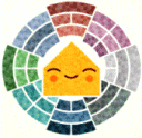
Color Language: |
|
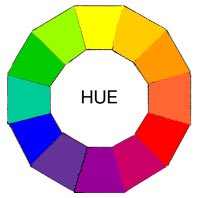
These are the family of
twelve purest and
brightest colors.
3 Primary Colors
3 Secondary Colors
6 Tertiary Colors
They form the full
spectrum of colors which
progress around the
Primary Color Wheel in
gradual increments.
With just these twelve
colors, you can
literally mix an
infinite number of color
schemes. Most of the
time you will modify
these twelve basic hues
by mixing in other
colors.
But nothing is stopping
you from using them
full-strength. This
multi-color scheme would
be bold, cheerful and
exciting. It would be
great in a child's
playroom. Bright, bold
selections can also work
to grab attention in
advertising and
marketing graphics.
Creating a painting with
these would be a little
jarring.
What's the difference
between a HUE and
COLOR
Most people, even the
pros, get confused about
this. Basically, they
mean the same thing and
can be used
interchangeably.
The words are a general
terms to describe the
family color on the
Basic Color Wheel that
your swatch is rooted
in. They indicate the
root of the variations
we see. To make things
simpler, think of a Hue
as one of the twelve
colors on the mixing
wheel.
Most Color Wheels only
show bright colors which
can create confusion.
It's not always easy to
see that every color,
even black, has a
Primary, Secondary or
Tertiary Color as its
root.
Burgundy = the root
Color or Hue is RED
Navy = the root Color or
Hue is BLUE
Rust = the root Color or
Hue is ORANGE
|

Every
individual color on the
Basic Color Wheel
can be altered in three
ways by
Tinting, Shading or
Toning.
And that's before we
even think about mixing
two colors together.
Let's
start with
Lightening
the twelve basic colors
to create
Tints.
A Tint is sometimes
called a Pastel.
Basically it's simply
any color with white
added.
That means you can go
from an extremely
pale, nearly white to a
barely tinted pure hue.
Artists often add a tiny
touch of white to a pure
pigment to give the
color some body.
A color scheme using
Tints is usually soft,
youthful and soothing,
especially the lighter
versions. All tints work
well in in feminine
environments. You often
see advertising,
marketing and websites
use pale and hot pastels
if they are targeting
women as a demographic.
So now
that you know how to
lighten, what's the
easiest way to make your
colors darker?
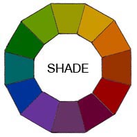
A Shade is simply any
color with black
added.
Just as with making
tints, you can mix
any of the twelve pure
colors together.
Then simply add any
amount of black and
you create a shade
of the mixture. That
means you can go from an
extremely dark,
nearly black to a barely
shaded pure hue.
Most artists use
black sparingly
because it can quickly
destroy your main color.
Some artists prefer not
to use it at all.
Shades are deep,
powerful and mysterious.
Be careful not to use
too much black as it can
get a little
overpowering. These
darks work well in a
masculine environment.
They are best used as
dark accents in art and
marketing graphics.
|
|
 |
Now that you
understand how to
lighten and darken your
twelve colors how do you
tone them down?
Almost every color we
see in our day-to-day
world has been toned
either a little or a
lot. This makes for more
appealing color
combinations.
A Tone is created by
adding both White and
Black which is grey. Any
color that is "greyed
down" is considered a
Tone.
Tones are somehow more
pleasing to the eye.
They are more complex,
subtle and
sophisticated.
Artists usually mix a
little grey in every
paint mixture to adjust
the value and intensity
of their pigment. Tones
are the best choice for
most interior decorating
because they're more
interesting. They work
well in any Color Scheme
you might plan |
|
MIXING COLORS |
|
|
What is remarkable is
that there are two
different concepts in
MIXING colors. One is
called Additive, and the
other subtractive. Both
will be familiar to you,
but you have probably
not thought deeply about
the concept.
Remember that what we
perceive of as COLOR is
actually light waves,
cascades of tiny
electromagnetic waves
flowing towards us.
These waves of light
have either come
directly from a
generating source ( the
sun, a light bulb, a
lamp) or have bounced off
of other objects.
Creating COLOR it is
dependent on the medium
with which a designer is
working. When painting,
an artist has a variety
of paints to choose
from, and mixed colors
are achieved through the
subtractive color
method. When a designer
is utilizing the
computer to generate
digital media, colors
are achieved with the
additive color method.
|
 |
Subtractive
Color.
When we mix
colors using
paint, we are
using the
subtractive
color method.
Subtractive
color mixing
means that one
begins with
white and ends
with black; as
one adds color,
the result gets
darker and tends
to black. Then
each paint color
is absorbing all
light waves
except the one
that is reflecting
back ( such as
the blue paint
absorbs all
light waves
except for blue)
When mixed, the
paint now
absorbs all
light waves and
appears black. |
 |
Additive Color
If we are
working on a
computer, the
colors we see on
the screen are
created with
light using the
additive color
method. Additive
color mixing
begins with
black and ends
with white; as
more color is
added, the
result is
lighter and
tends to white.
This also occurs
in the theatre,
when creating
WHITE light, all
the different
light cans are
pointed in one
place. |
|
|
When I think about how
color is created,
it becomes very real to
me that this is not just
a pretty phenomenon that
we see with our eyes,
but an energy and force
that effects us in every
surrounding and at all
times.

Journey now to our first
COLOR - Red |
|